
Poster
50 years of changing diversity in global food supplies
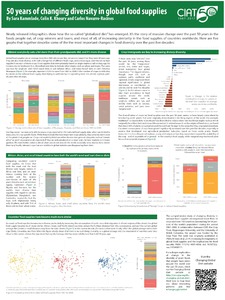
Newly released infographics show how the so-called “globalized diet” has emerged. It’s the story of massive change over the past 50 years in the foods people eat, of crop winners and losers, and most of all, of increasing similarity in the food supplies of countries worldwide. Here are five graphs that together describe some of the the most important changes in food diversity over the past five decades