
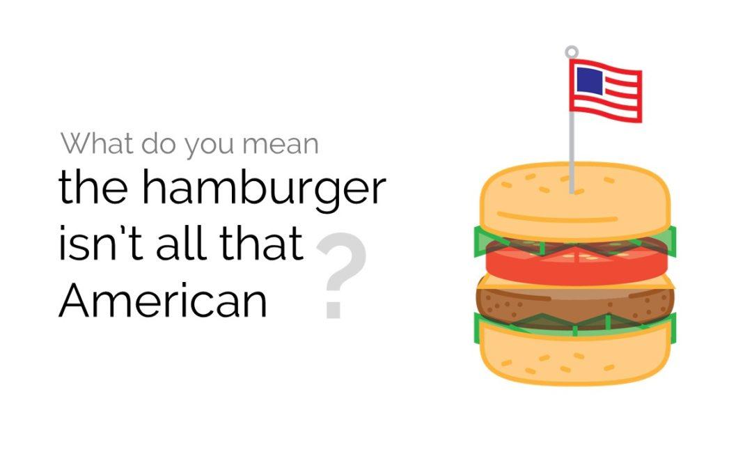
What do you mean the hamburger isn’t all that American?
Scientists and graphic designers are joining forces to strengthen the communication power of research through attractive, informative, and even surprising visuals.
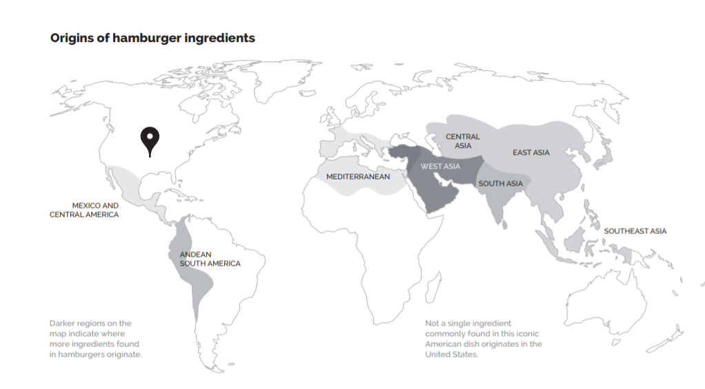
Say you’re a scientist who studies the origins and history of food, and you want to communicate to the world your findings that the all-American hamburger – including the side of fries – doesn’t contain a single ingredient that originally came from the United States. You could publish an article in a top-notch journal, ask a communications officer to write a press release about the paper, or take to Twitter and tell your hundreds of devoted followers all about your discovery. All of these create some impact.
But you could also join forces with a professional graphic designer and map out the ingredients’ origins in an attractive infographic display, and by publishing it, potentially reach a much wider audience.
This is exactly what Colin Khoury of the International Center for Tropical Agriculture (CIAT) did. And the end result communicates his findings perhaps just as well – or perhaps even better than – the common communications channels that scientists use. Now Khoury – who also took the pizza to task for not being all that Italian and pad thai for being less than wholly Thai – and his collaborators at leading universities are encouraging their scientific colleagues to embrace graphic design as a serious asset in science communication efforts, as well as a useful process for the advance of science itself.
Click on the images to see the infographics


“Visual depictions of scientific findings aren’t a new thing. In fact, people have been making them for hundreds of years, and especially since scientific journals started to publish. But new technologies, new audiences, and new ways to communicate are making high-quality, sophisticated graphics ever more important, and collaborations with skilled professionals are the most productive way to create them.”
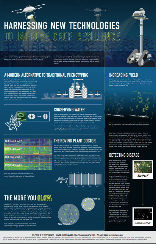
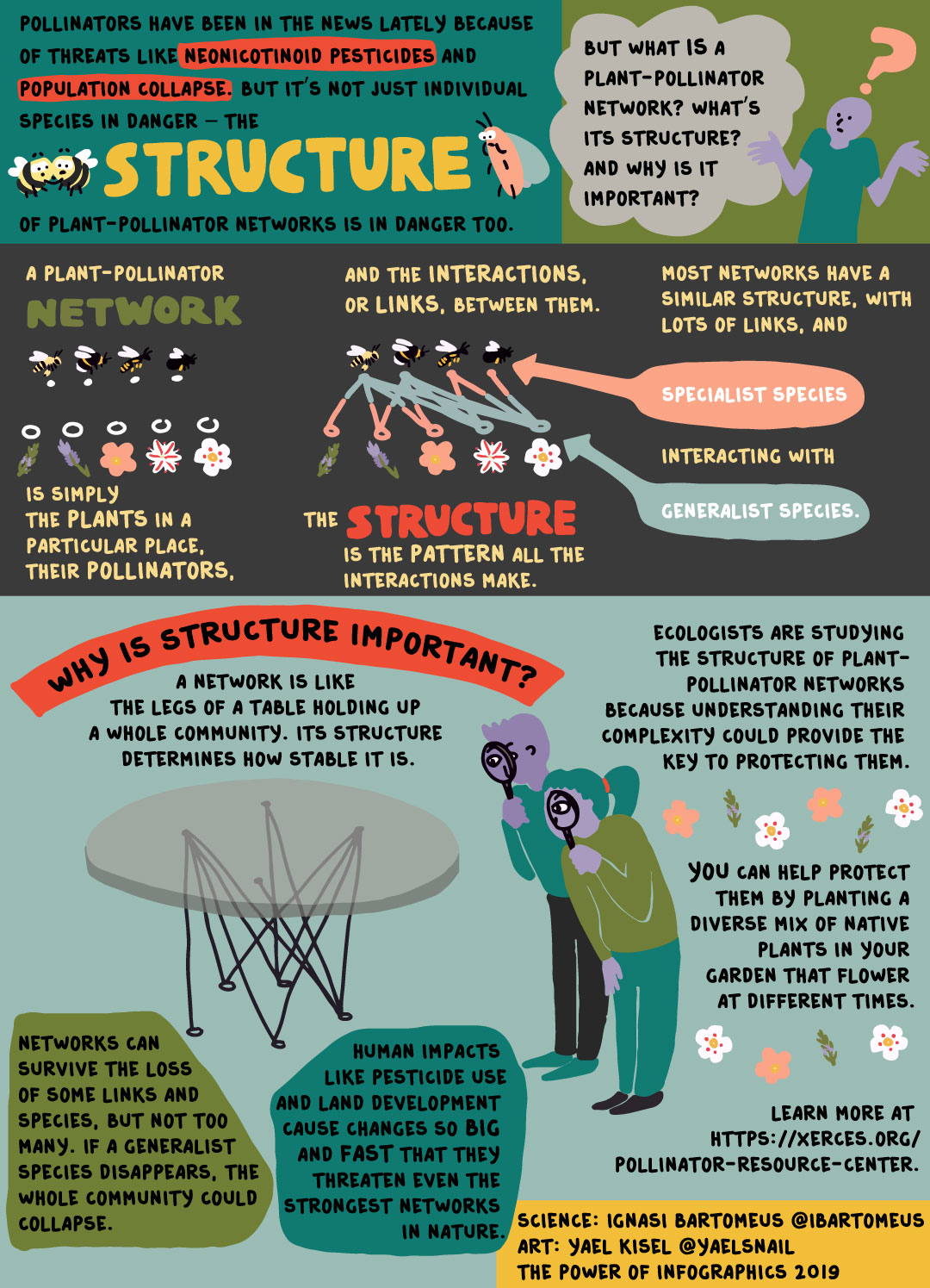
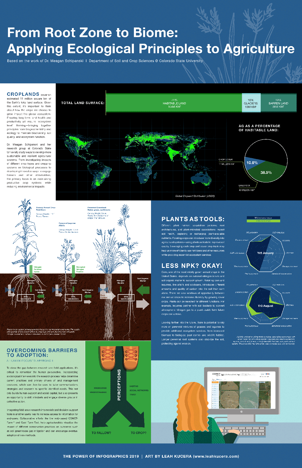
Colin KhouryTo test the efficacy of collaborations between scientists and graphic artists, Khoury and colleagues paired six research laboratories that work on societally relevant food and agricultural challenges with graphic designers and media content creators. In addition to the food origins research, they tackled complex subjects related to pollinators and biodiversity threats, modern plant breeding, agricultural development and land-use change, and new technologies in agriculture.
The scientists first presented the results at this year’s annual meeting of the American Association for the Advancement of Science (AAAS).
Challenging scientists to identify audiences and clarify their messages
The collaborations began with asking the scientists to define their target audience and “the general public” was not an acceptable answer. To explain the importance of pollinators and biodiversity, the teams eventually identified the target audience as “English and Spanish speakers already interested in biodiversity conservation,” which led to a relatively detailed infographic with versions in English and Spanish.
The scientists agonized over the challenge of distilling complex concepts into clear, focused, and accessible messages, but the process helped them push their science forward. In some cases, they better identified the central components of their work. In others, they discovered areas they hadn’t studied sufficiently.
Related articles:
Khoury CK, Achicanoy HA, Bjorkman AD, Navarro-Racines C, Guarino L, Flores-Palacios X, Engels JMM, Wiersema JH, Dempewolf H, Sotelo S, Ramírez-Villegas J, Castañeda-Álvarez NP, Fowler C, Jarvis A, Rieseberg LH, and Struik PC (2016) Origins of food crops connect countries worldwide. Proceedings of the Royal Society B (Proc. R. Soc. B) 283(1832): 20160792. doi: 10.1098/rspb.2016.0792. https://doi.org/10.1098/rspb.2016.0792
Interactive website: http://blog.ciat.cgiar.org/origin-of-crops
Map: Origins and primary regions of diversity of agricultural crops